

Style your email with themes and design settings
The Design tab holds the email’s defaults: its width and backgrounds, and the look of its titles, text, links, buttons, dividers and spacers. Every block follows them until you style that block yourself. A theme is a set of these defaults with a name, saved for your site, so that every newsletter can look the same. Set an email’s look here rather than block by block, starting from your site’s theme, such as EnovaPoint Brand: one change then restyles every block that follows the design.
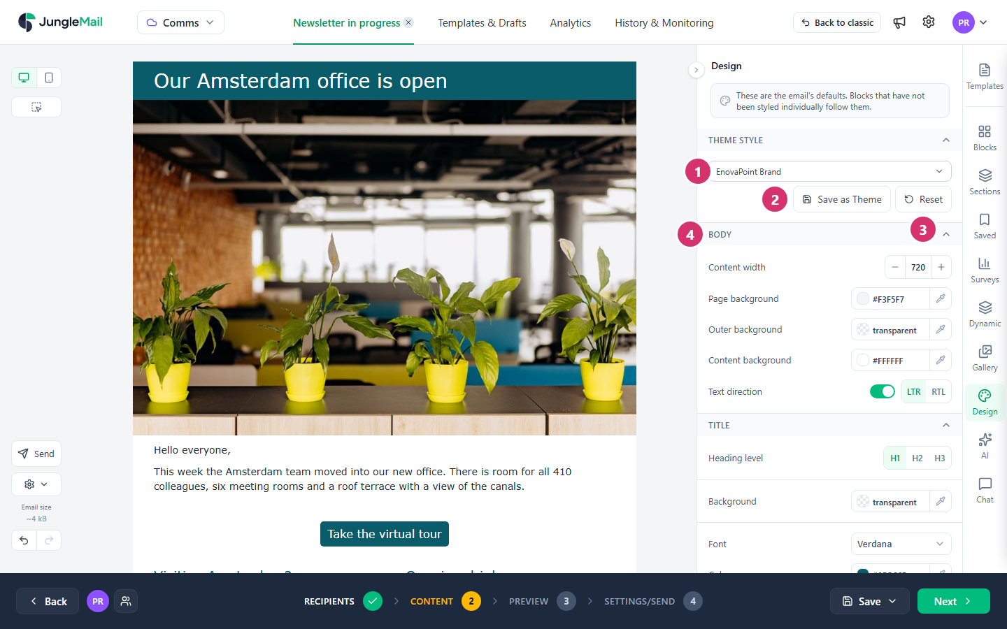
Apply a theme or change the design
Section titled “Apply a theme or change the design”In the Content step, select Design.
-
To apply a theme, choose it in the list under Theme Style. It replaces the whole design except the content width, in one step that Undo can take back. The list shows Original template theme while the email follows no theme.
-
To keep the current design for later emails, select Save as Theme, type a name, such as
EnovaPoint Brand, and select Save. Theme names must be unique. -
Reset takes the design back to the chosen theme, or to how the email was when you opened it.
-
Change the defaults themselves in the groups below:
Group Sets Body Content width, Page background around the email, Outer background behind every section, Content background behind the content, and Text direction Title Each heading level’s font, color, size and spacing. Choose H1, H2 or H3 in Heading level first Text The font, color, size and spacing of text, including Paragraph spacing Links The Colour of links, and whether they are Underlined or Plain Button The buttons’ colors, font, Corner radius, Border and padding Divider The line’s Style, Thickness and Colour Spacer The default Height
Keep Content width between 600 and 800 pixels: a wider email can make readers scroll sideways or cut off part of it (Troubleshoot Email Rendering in Customer Insights - Journeys).
Site administrators also see Set as default theme and Delete theme when they point to a theme in the list. The default theme, marked with a check mark, is applied to each new newsletter and template made on the site in the Drag & Drop Builder; a site without one uses the Global site’s default theme. Themes belong to the site they were saved on. A theme marked with a globe was saved on the Global site and is offered on every site; it can’t be deleted here.
Make a block follow the design again
Section titled “Make a block follow the design again”A block you styled yourself keeps its own style when you change the design or apply a theme. In its properties, a setting you changed has a green arrow beside its name; select the arrow to go back to the design’s value.
To do this for many blocks at once, pick them in selection mode and select Inherit styles from design (Select and style several blocks at once).
- On a new email, apply the theme after the content. Build the structure and write the content first, then apply a theme, and only then style the blocks that should look different: a block styled earlier keeps its own style when the theme is applied.
- Make your brand theme the site’s default. A site administrator points to it in the list and selects Set as default theme; every new newsletter and template made in the Drag & Drop Builder then starts with it.
- Check the contrast of text, links and buttons. Text needs a contrast ratio of at least 4.5:1 with its background, and large text, about 24 pixels or 18.5 pixels bold, at least 3:1 (Understanding Success Criterion 1.4.3: Contrast (Minimum)). That includes the text on buttons.
- Look at the email in dark mode. Most email programs change an email’s colors in dark mode, each in its own way (Troubleshoot Email Rendering in Customer Insights - Journeys). Check it with Dark mode preview in the Preview step, an approximation of what readers see (Preview and test a newsletter).
- Ask for your brand’s colors and fonts. A site administrator can add them under Branding, so that the color pickers and the font list offer them, and can limit editors to them (Fonts, colors and other branding settings).