

Show content on desktop or mobile only
Many recipients read newsletters on a phone. In Mobile view you see the email at a phone’s width and can change how it looks there without changing the desktop version. With Show on, a block or section appears only on computers or only on phones, for example a wide banner on desktop and a narrower one on phones. Start with the mobile settings, which change how the same content looks; keep Show on for content that needs a different version on phones.
Change how the email looks on phones
Section titled “Change how the email looks on phones”In the Content step, select Mobile view at the top left. The email narrows to the width of a phone.
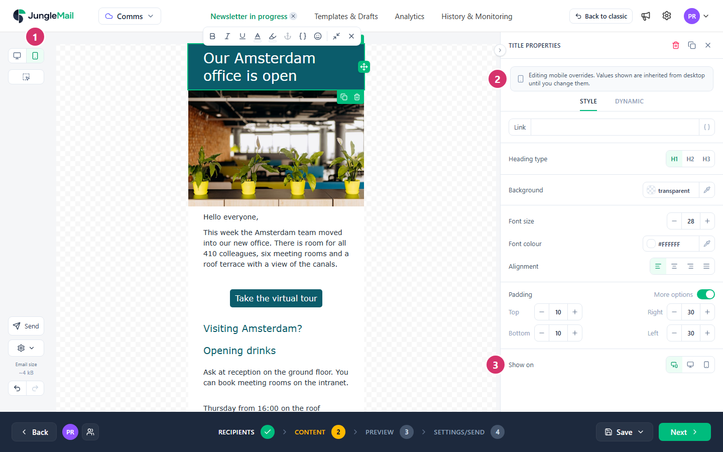
- In Mobile view, select the block or section to change.
- Its properties say Editing mobile overrides. Values shown are inherited from desktop until you change them. Besides settings that apply everywhere, such as a link, they show what can differ on phones, such as the font size, alignment and padding. What you change in those applies to phones only, and a green arrow beside the setting takes it back to the desktop value.
- To show the block only on phones or only on computers, choose Mobile only or Desktop only in Show on. Both shows it everywhere. Use it for two versions of the same content, not for content that only some readers should get: a reader who opens the email on a computer never sees what is shown only on phones.
Select Desktop view to go back. In Desktop view, content shown only on phones is blurred and labeled Mobile only; in Mobile view, desktop-only content is blurred and labeled Desktop only. To hide it from the canvas instead, select Actions (the gear) > Hide other devices’ content. That changes only what you see while you work, not the email.
Settings that only exist for phones
Section titled “Settings that only exist for phones”| Setting | Where | What it does |
|---|---|---|
| Layout | A section, in Mobile view | One per row stacks the columns, as new sections do. Keep side by side keeps them in a row. Two per row is for sections of four or six columns |
| Reverse order | A section of two or four columns, with One per row | Stacks the columns in the opposite order, for example to put a picture above its text on every row |
| Full width on mobile | An Image or Video block | Makes the picture as wide as the phone’s screen |
- See how many of your readers use phones. Reading Devices in a newsletter’s report shows the share of opens on a phone, so you know how much the mobile version matters to your readers (Read a newsletter report).
- Give a banner with words in it a version for phones. A picture shrinks to the phone’s width, and the words in it shrink with it. Mark the wide banner Desktop only and a narrower one with larger words Mobile only, and put anything important, such as the date of the town hall, in a Text block too (Make your emails accessible).
- Keep columns side by side only for small things. Keep side by side squeezes each column into part of a phone’s width, which suits a row of icons or two short figures, not text or photos.
- Put pictures above their text. In a section with the picture to the right of its text, select Reverse order, so that on phones the picture comes first, as it does in sections with the picture on the left.
- Check it on a real phone. Mobile view shows the email at a phone’s width, but only a test email shows it in your readers’ mail app (Preview and test a newsletter).